Power BI Dashboard: Data Visualization and Analysis
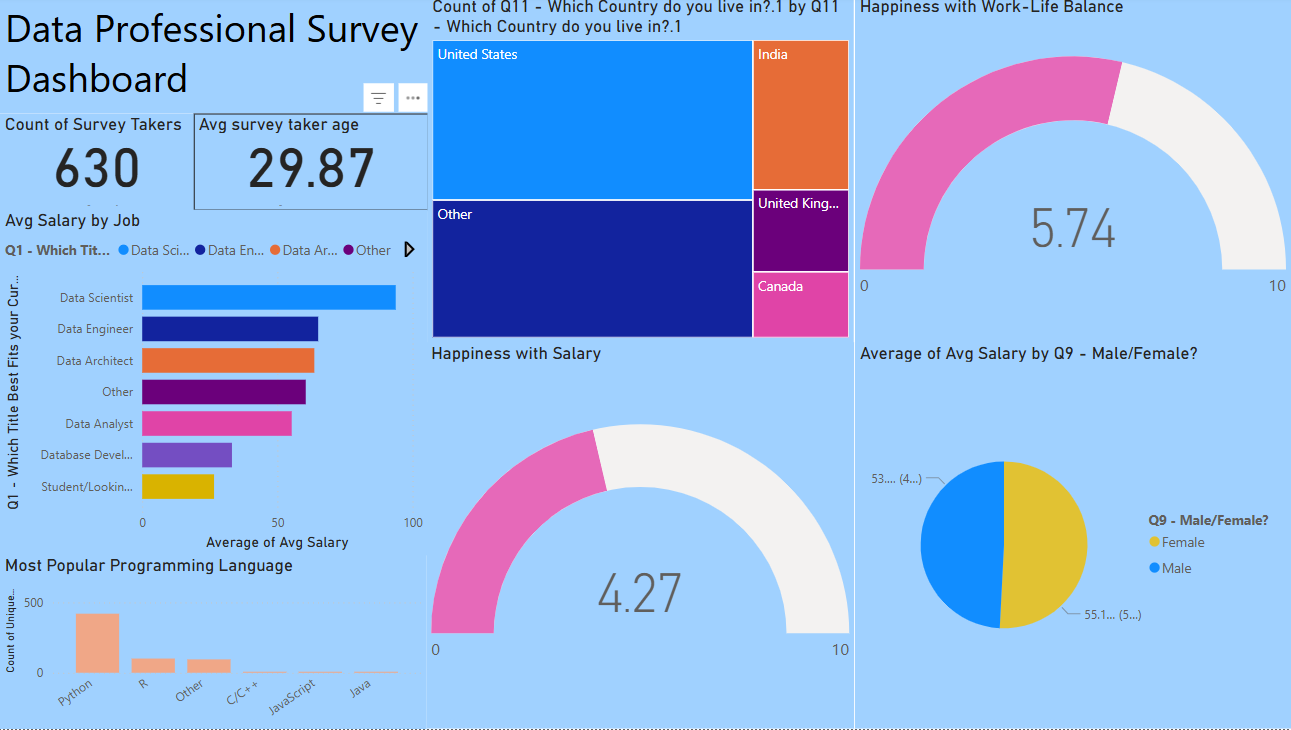
This project demonstrates my experience with the application Power BI as a data visualization tool. The analysis focused on visualizing key insights from a dataset about data analysts. I utilized various Power BI features to create interactive dashboards and detailed visualizations. This Power BI project demonstrates my ability to not only analyze and visualize complex data but also present it in a way that is easily digestible and useful for decision-making. By leveraging Power BI's capabilities, I''ve been able to generate valuable insights that can drive business and operational strategies.
Project Overview
In this project, I created a dashboard that visualizes data about data analysts, showcasing key performance indicators and trends. The Power BI Dashboard includes visualizations such as bar charts, line graphs, and pie charts to provide insights into data trends and patterns. Key features of the dashboard include:
- Interactivity: Built a dynamic dashboard with clickable elements for filtering data.
- Data Exploration: Utilized Power BI's data transformation and querying tools to prepare and clean the dataset.
- Identifying Key Insights: Focused on visualizing data related to salary, experience, location, and other key metrics for data analysts.
- Demonstrating Data Trends: Used line graphs and bar charts to identify and highlight trends in the data.
Link to GitHub Repository
You can access the full project, including the Power BI file and related resources, on my GitHub repository. Click the link below to view the repository:
GitHub: Data Professional Power BI ProjectSkills Developed
Through this project, I further developed the following skills:
- Power BI Visualization: Creating interactive dashboards and visualizations using Power BI’s native features.
- Data Transformation: Preparing and transforming raw data for visualization through Power BI’s Query Editor.
- Advanced DAX (Data Analysis Expressions): Using DAX to calculate key metrics and create meaningful insights from the data.
- Data Storytelling: Designing visualizations that tell a clear story and provide actionable insights to stakeholders.
Conclusion
This Power BI project demonstrates my ability to not only analyze and visualize complex data but also present it in a way that is easily digestible and useful for decision-making. By leveraging Power BI’s capabilities, I’ve been able to generate valuable insights that can drive business and operational strategies.