Airbnb Data Visualization with Tableau
Interactive dashboard analyzing Airbnb listing data from 2016
Project Overview
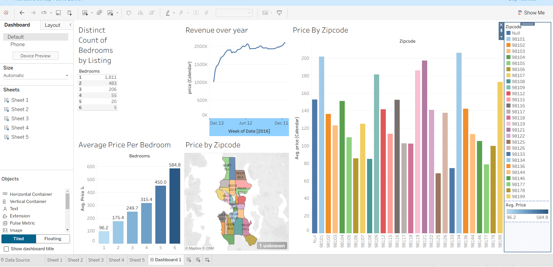
This Tableau visualization project explores Airbnb listing data from 2016, transforming raw data into interactive, insightful visualizations. The dashboard provides a comprehensive view of pricing trends, location popularity, room type distribution, and other key metrics that would be valuable for both hosts and travelers.
Key Features
- Interactive map visualization showing listing distribution and pricing by neighborhood
- Price analysis by room type with comparative metrics
- Time-based visualization of booking availability
- Dynamic filtering to explore specific data segments
- Dashboard designed for intuitive data exploration
Skills Developed & Applied
- Data Visualization: Created meaningful visual representations of complex data
- Tableau Proficiency: Utilized Tableau's full suite of visualization tools
- Data Cleaning: Prepared raw data for effective visualization
- Dashboard Design: Developed an intuitive, user-friendly interface
- Storytelling with Data: Structured visualizations to convey clear insights
- Geospatial Analysis: Incorporated map-based visualizations
Project Insights
Through this project, I gained valuable experience in transforming raw data into actionable insights. The visualization reveals clear patterns in pricing strategies, popular locations, and property types that could inform business decisions for both Airbnb hosts and the company itself. The interactive elements allow users to explore the data from multiple perspectives, demonstrating the power of Tableau for exploratory data analysis.